One of the most powerful ways to increase online donor conversions is also one of the most obvious: put a donate button on your homepage! Here’s how.
When someone lands on your homepage, what do you think is the most common question they have on their mind?
Well, the answer is it depends on how they got to your web page.
The source of your traffic largely determines what your visitor wants and needs to know.
If they typed your name into Google, the possibility that they want to give is relatively high.
Sure, they might simply be doing some research or browsing. But unless you are a large organization with loads of brand awareness floating out there, you’d be surprised at how many people are coming to your site with the intention of giving.
This is especially true if you’re a smaller or startup organization. The odds are that a good chunk of your site’s traffic will be made up of people who know you and believe in you.
They’ll arrive primed to give.
So now the time has come to facilitate the donation.
If your visitor came because they’re looking for you, or because they clicked on a link in the email you sent them, the first question they’ll have on their mind is…
How do I give?
If it’s not clear where they should click in order to give, you’ll leave a lot of potential gifts on the table.
They can’t give if they can’t find your donation page. It’s as simple as that.
Every nonprofit needs a donation button on their homepage.
So first, some good news. In our benchmark study with NextAfter, We studied the donate button language on each website and found that 78% of nonprofits use “donate” language for their button, as opposed to “give” or “support” language.
This will make it easier for donors to understand where to give.
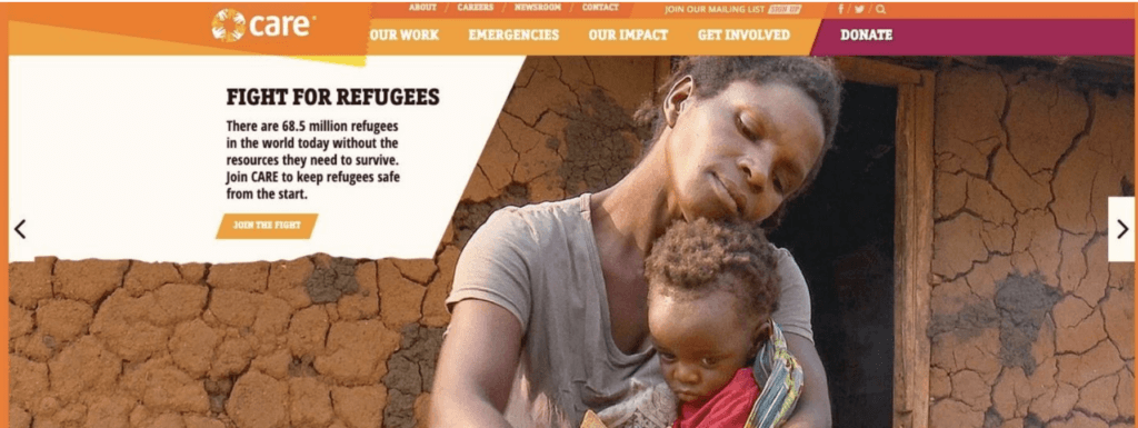
Here’s an example of this from Care.

As you can see, their donate button in the navigation is a different color and says “donate”.
If you’re interested in making a donation and you’re looking at the homepage, it’s very clear where you need to go to make a donation.
This might feel obvious, but reality is often quite different than our feelings. Not every organization is using donate language, even fewer including the option in their site navigation, and even fewer are making the donation option stand out with a different color or button. The key is that you want the desired action to be clear and obvious.
For some organizations in this study, we had to hunt for the donate button.
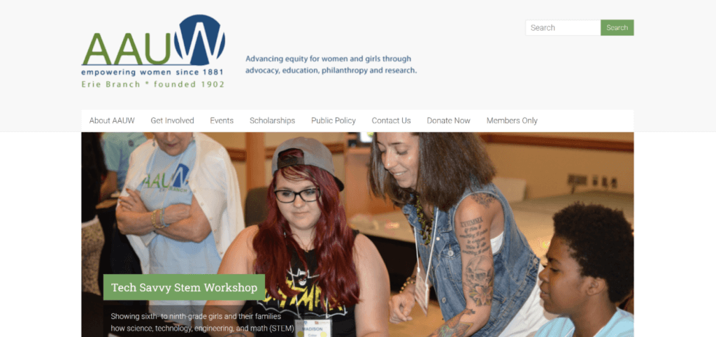
Here’s an example of what many nonprofits do with their donate button.

It’s a plain language link in the menu.
If you can spot it, you’ll realize that there’s no difference in color, size, typography, or design.
It just blends in with the rest of the page, and hopes that you’ll be able to find it.
Please don’t make your donors have to explore your entire site just to find where to give!
Craft buttons that are obvious and have a contrasting color that’s easily seen.
What language should you use in your donate button?
The language you use in making the donate button stand out is really important.
In this experiment featured in our benchmark study, we compared how emphasizing the donate button would affect traffic.


As you can see in the control, the donate button looks just like any other tab in the navigation.
Same color. Same typography. Same design.
In treatment one, the button says, “Donate” —and— in treatment 2, it says, “Support DTS”.
In each of the treatments, the button is purple and stands out on the page. It’s more clearly delineated where you can go to make a donation.
For treatment one, DTS saw a 190% increase in donations. In treatment two, there was a 160% increase in donations.
Just by making it easier to find the donate button, this organization raised 190% more in donations!
Simple and Powerful
It’s incredible how small, simple changes can increase your ability to raise donors.
Check your own homepage right now and see if your donate button is clearly visible and has donor-friendly language like “Donate” or “Support.”
These little tweaks alone can make a big difference in conversion rates on your general donation page.
But don’t take my word for it. Check out the study to see the data for yourself!


