“Small improvements lead to staggering results.”
Robin Sharma
I recently set out on Amazon for something completely innocent—dish soap, maybe? Who remembers. All I know is, fifteen minutes later, I had a vegetable spiralizer in my cart, plus a glowing LED showerhead that changes colors depending on the water temperature. Was I planning a tropical spa experience in my bathroom? Apparently, yes. And the thing is, I didn’t even realize what had happened. Amazon had made me feel like these were essentials. Essentials!
And I wasn’t even mad about it.
If you’ve ever been through the Amazon funnel, you know what I’m talking about. Somehow, they always manage to make you feel like everything you didn’t know you needed is actually vital to your well-being. It’s like they’ve been reading your mind—or maybe your browser history—but either way, the experience is seamless.
So, how does Amazon do it? Three words: Conversion Rate Optimization (CRO). It’s the not-so-secret sauce that turns casual browsers into enthusiastic buyers, and it’s all about creating a personalized, frictionless experience.
Let’s dive into some real-world examples of CRO at work, so you can figure out how to turn your website into a similar conversion machine—though, sadly, without the glowing showerheads.
Amazon: The Personalization Wizard
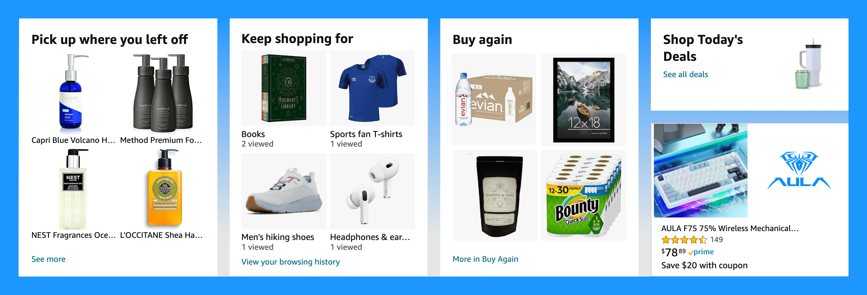
Imagine this: you’re scrolling Amazon, and suddenly it feels like the site knows you better than your own family.
The recommendations? Spot on. The “Frequently Bought Together” items? Pure genius. It’s like Amazon is reading your thoughts, predicting your next purchase before you’ve even had a chance to think about it.
And the best part? One-click purchasing. It’s almost too easy, like they’ve set up the ultimate “Treat Yourself” button right next to the “Buy Now” option.
Amazon’s success isn’t magic (though it feels that way). They’ve just perfected the art of personalization. They use data like a treasure map, carefully guiding users through a maze of products they didn’t know they needed. By the time you realize what’s happening, you’ve already hit “Place Order.”
Key Takeaway: Dive into data like it’s gold. Every click, scroll, and abandoned cart is a clue about what your customers want—even if they don’t know it yet. The more you analyze, the more you can fine-tune your experience, turning casual browsers into loyal, repeat buyers.
Airbnb: The Booking Whisperer
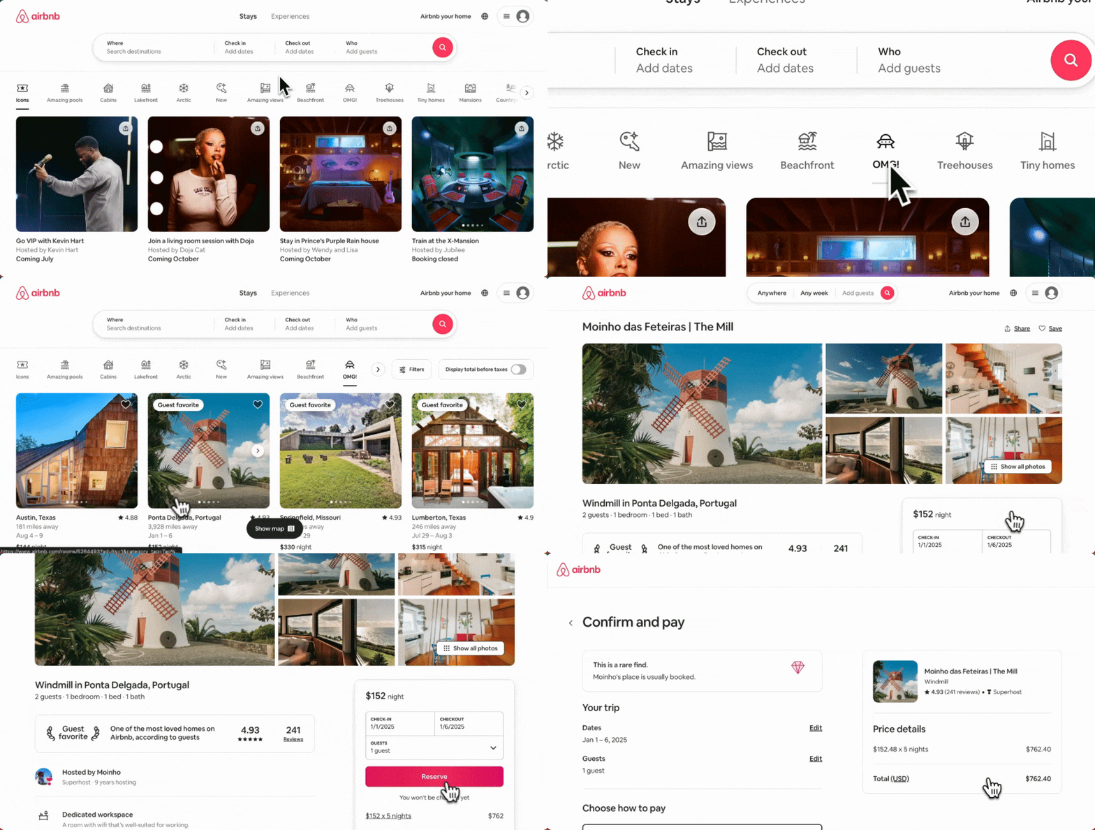
Ever gone to Airbnb “just to browse” and found yourself mentally packing for a weekend getaway in a cabin you had no plans of visiting? Within minutes, you’re transported into the vacation of your dreams, sipping hot cocoa by the fire, even though you’re still in your pajamas on the couch.
That’s the magic of Airbnb. They’ve made the booking process so smooth that you barely notice you’ve committed to a stay until it’s time to leave a review. The interface? Clean. The steps? Minimal. It’s like the vacation starts the moment you hit the search button. You didn’t even have to go anywhere.
Key Takeaway: Strip away the fluff. Make your user journey smoother than a freshly Zamboni’d ice rink. Remove unnecessary steps, and watch the conversions roll in like your packed suitcase.
Dropbox: The Social Proof Guru
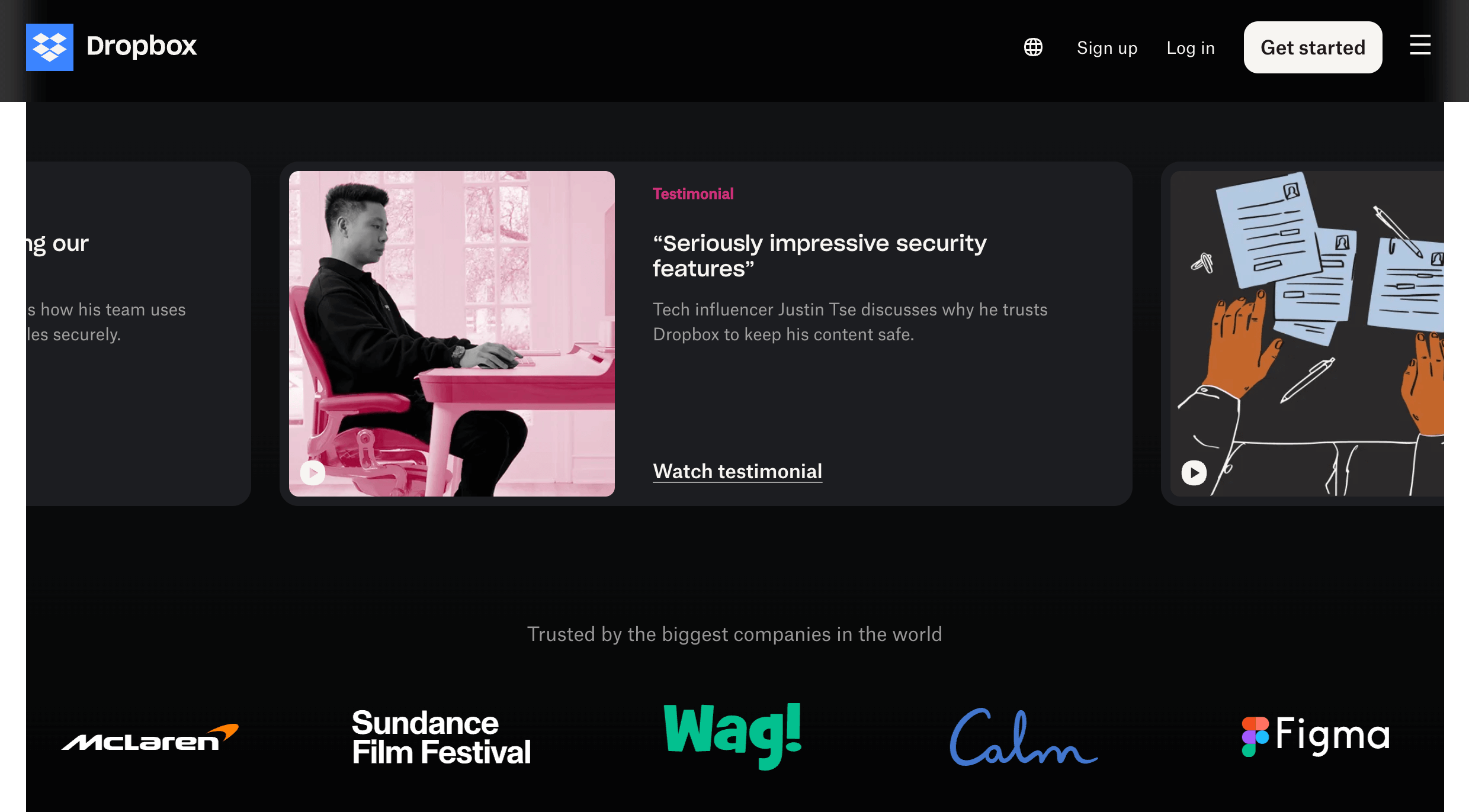
Dropbox is like that cool, laid-back friend who casually drops into conversation that millions of people trust them with their most important files, and somehow, you’re convinced.
They don’t even have to tell you they’re good—they just let the evidence speak for itself. Testimonial after testimonial, success story after success story, all without a hint of pushiness.
The beauty of Dropbox’s CRO strategy lies in social proof. They sprinkle their website with testimonials and impressive stats about satisfied users, making it nearly impossible not to join the ranks of those who trust Dropbox with everything from critical work files to cat videos.
Key Takeaway: Let others do the bragging for you. Display testimonials, reviews, and success stories prominently. When in doubt, let your happy customers handle the talking.
4 Practical Tips for CRO
Now that we’ve looked at the masters in action, let’s dive into a few tips for weaving some of that CRO magic into your own website.
1. A/B Testing
Think of A/B testing like having two plates of cookies in front of you. Both look delicious, but one has a little more chocolate, and the other has that perfect crispy edge. Which one wins? You’ll never know until you let your taste-testers (i.e. your website visitors) have their say.
Constantly experiment with different headlines, images, and calls to action. You never know which small tweak could lead to a 10% increase in conversions—and that’s a lot of cookies.
2. Landing Pages
Your landing page is like a first date. If you show up with spinach in your teeth and a three-paragraph rant about your ex, you’re not getting a second one. The same goes for your landing page—keep it clean, clear, and inviting. Tell visitors what they’re getting into, give them a reason to stay, and make it easy for them to say “yes” to your offer.
Catchy headlines, beautiful visuals, and concise copy are your best friends here. Make sure your call to action is as irresistible as a free puppy.
3. Mobile Experience
Your website should work as smoothly on a smartphone as it does on a desktop. It’s like trying to squeeze all the charm of your favorite café into a tiny to-go cup—sure, it’s smaller, but it still needs to be just as enjoyable.
Make sure your site is responsive, thumb-friendly, and loads faster than someone’s patience with slow Wi-Fi. Mobile users don’t have time for endless scrolling, so give them what they need, and give it to them fast.
4. Heatmaps and Analytics
Heatmaps and analytics are like having a magnifying glass on your website. They show you where visitors are getting stuck, where they’re clicking the most, and where they’re abandoning ship altogether. In other words, they help you solve the mystery of why that “Buy Now” button is being tragically ignored.
Use these tools to regularly audit your site and see where you can make improvements. Sometimes, the smallest change—moving a button or adjusting a headline—can make all the difference.
The Happy Ending
So, whether you’re making personalized recommendations, simplifying your booking process, or letting your satisfied customers speak for themselves, CRO is the not-so-secret ingredient to turning casual browsers into loyal buyers. It’s about crafting an experience so seamless, so delightful, that visitors don’t even realize they’ve clicked “Buy Now” until it’s already done.
And maybe, just maybe, you’ll find yourself like me, wondering how you ended up with a glowing LED showerhead—and loving every second of it.


