Friction is anything that causes psychological resistance to a given element in the donation process. The more friction you have on your donation pages, the less likely it will be that your donor will choose to give.
Therefore, our work is simple. Remove the friction in the giving process.
But that isn’t nearly as easy as it sounds.
Why? Because when you’re not the donor it’s hard to see the friction in your process.
You understand all the elements – and where they’re leading the donor.
Since you’re the one who created the donation page and all its elements, you know the end goal.
And you’ve got complete confidence in yourself and your organization to do the right thing with the donation after the donor has given it to you.
But what about your donor?
They don’t know any of that.
All they have is what you’ve presented to them on your donation page.
No insider information. Just the copy and design in front of them.
So when your donation page has friction on it, it’s a big deal.
I want to begin a series of blog posts diving deep into various kinds of friction your donors and potential donors encounter when they visit donation pages.
These are points of friction we found while researching our benchmark study The State of Nonprofit Donation Pages.
Some of these points of friction might seem trivial.
But that’s because you have all the inside information. What’s more important is…
Is it trivial to your donor?
Come to find out, these points of friction can mean everything when it comes to a donor saying yes… or no.
Field number friction
The number one cause for friction in donation pages is field number friction.
This kind of friction is when you require extra information from the donor that’s not entirely necessary to the donation process.
The more fields you require, or the more friction you put in front of a donor, the less likely they are to complete the task.
More importantly, if they don’t finish the task of giving through your donation page, they won’t become your donor.
As you know, raising donors is ultimately much more profitable for your nonprofit than simply raising donations.
Donations are one-time transactions. Donors represent fertile relationships where multiple donations are given over a lifetime.
So what does field number friction look like?
Benchmark study experiment
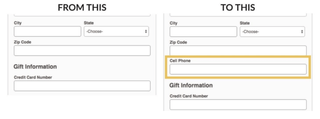
In this experiment in our benchmark study, the only difference between these two forms is that the cell phone field is required in the treatment page.

Adding a field requiring the donor’s cell number caused a 50% decrease in donations.
We lost the chance to raise half of the donors in this experiment!
What’s the big lesson from this experiment?
Field number friction is a big deal.
Now, when we made the cell phone field optional, there was no difference in the conversion rate.
But adding required fields that aren’t necessary for the gift is the worst kind of friction for potential donors.
The usual suspects
Do you have unnecessary required fields on your donation pages?
Chances are, you do.
In our research, we found that 40% of organizations required non-essential information to complete a donation.
This means they required information other than what was really needed to process the gift. This could be a phone number, a title, CAPTCHA, or a question about how you found out about them.
The most required non-essential information was a phone number (25%)
If you’re going to require a phone number, you have to make sure you make up the value somewhere else in the process in terms of upgrades or thank you’s.
This creates a lot of friction and anxiety in the process because people don’t know what you’re going to do with their personal phone number.
Some organizations required a title (8%)
But do you really need to know if they’re a Mr. or Mrs.?
Do you really want to identify them that way? Do they want to be identified that way?
A number of organizations required CAPTCHA (8%)
This is a security measure where you have to play the “are you a robot?” game and choose which pictures are street signs to pass the test.
At first, you’d think that CAPTCHA forms are a smart way to increase security on a giving form.
However, you really don’t need those security methods anymore.
They no longer have a place and they add a lot of extra friction.
Some organizations required the gift’s motivation (4%)
Several nonprofits required donors to answer questions like…
- “What inspired you today?” or
- “How did you hear about us?”
These aren’t necessarily bad questions, but if you have data analytics on your donation page, you could always go to your analytics report to show you where they came from.
It’s not an either/or situation!
Relying on your data analytics rather than requiring extra information would reduce the friction for your donors while still giving you the marketing insights you need.

Turns out, you really can have your cake and eat it, too.
The trouble with motivation
The question of giving motivation in particular, makes donors stop in the donation flow process because it’s tough to answer.
It’s hard to pinpoint exactly what motivates us, particularly when it comes to giving.
Instead of asking it in this donation process, you could ask it after the donation, in the welcome series on a survey, or on the confirmation page.
As tempting as it is, don’t ask donors about their motivations in the middle of a donation flow.
Another required field was designation (2%)
If your organization has different funds, this field requires people to choose a fund to which they’ll designate their gift.
Problem is, they might not know much about the fund before they complete a donation.
Unintentionally, you’re forcing them to designate funds without context.
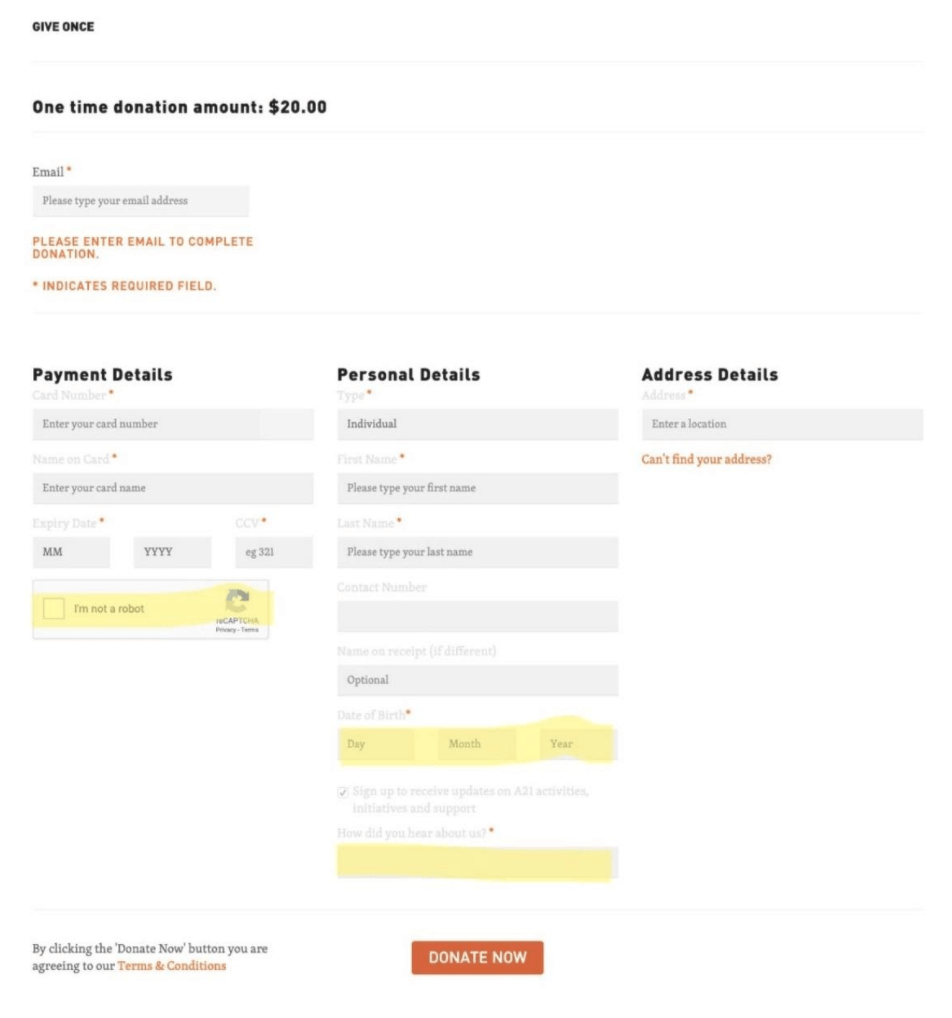
This is an example we found in our research.
You can see in the pending details that there’s a CAPTCHA here to prove you’re not a robot before you can enter your information.

On the personal details section, they require you to put in your data first.
This is probably so they can say happy birthday or encourage you to do a birthday fundraiser, but they don’t make it clear why they’re asking for your birthday.
Some people might be sensitive to giving out their age.
This page also requires a “how did you hear about us?” answer before you can complete the donation.
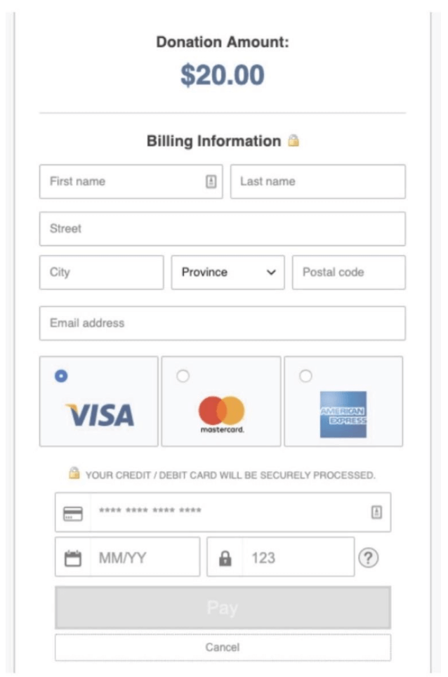
Compare that example to this page

The layout is more pleasing, and the information that’s required is only the bare minimum that’s needed.
It’s not filled with friction. If I want to complete my donation, this page allows me to do so in a streamlined manner.
Bottom line
Field number friction is number 1 on the donation page friction most-wanted list.
This friction is costing you up to half of the donors you could be raising!
It’s very likely that your forms require extra information that’s unnecessary for the donation process.
So please, review your donations pages and limit the number of required fields and information to process a gift.
And if you have to collect certain information, make it optional or provide context showing why you need it.


