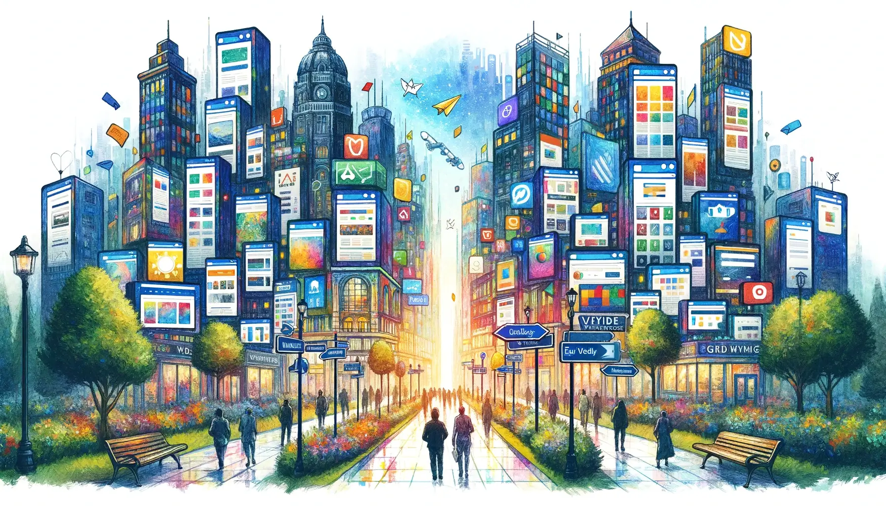
Visiting a website is like stepping into a new city. The streets are filled with information, destinations are numerous, and opportunities are limitless. But there’s no guide. You’re on your own, navigating unfamiliar terrain. When you can’t make sense of the signs, when intersections baffle you, when your destination is unclear, frustration sets in. Like a traveler lost in a foreign land, the easiest path out of confusion is to retreat. It’s a single click. The back button. Your digital escape hatch.
Online visitors are explorers in a virtual world. They come with a purpose: seeking answers, needing services, hunting for treasures. Like explorers, they crave simple maps, clear directions, and signposts that guide them through their journey. A website should serve as a compass, pointing visitors in the right direction, leading them straight to their goal. If it fails to do so, if it leads them down twisted paths and dead ends—visitors get confused. And a confused visitor is a frustrated explorer.
A frustrated explorer seeks the quickest exit. It’s not a door or a portal—it’s simpler than that. A small arrow, nestled in the top corner of the screen. The back button. It’s a lifeline in a maze of confusion. One click, and they’re back in familiar territory. They’ve escaped the labyrinth. It’s the easiest resolution to the frustration of confusion. But it’s also a missed opportunity.
Because each click of the back button is a vote of no confidence. A rejection of complexity, of confusion. A plea for clarity, for simplicity. It’s an alarm bell for web developers, a wake-up call for designers. Every click of the back button is a visitor lost, a customer gone, a story unheard.
To keep visitors engaged, we must clear the path. Simplify the journey. Make the experience a delightful exploration, not a puzzling maze. Avoiding the siren call of the back button means investing in intuitive design, clear navigation, and straightforward content.
Remember, a website is not a puzzle to be solved but a journey to be enjoyed. If the path is clear, the explorer will journey on, delving deeper into your digital city, immersing themselves in the experiences you offer. If the path is convoluted, they’ll find the quickest way out.
That’s the back button.


