“A reminder about your logo and brand color: Your brand defines how they’re perceived. Not the other way around.”
Bill Kenney
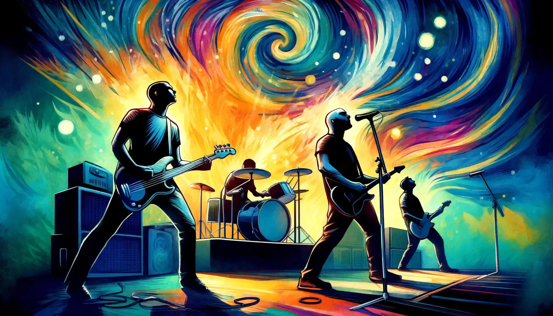
When I was a kid, my friend Jerry and I dreamed up a plan to start our own band.
We spent hours on the porch, tossing names back and forth like a tennis ball—names that ranged from the absurd (“The Exploits”) to the laughably grandiose (“The Electric Monarchs”). We had no instruments, no songs, and certainly no idea what we were doing, but we did have names. Lots and lots of names. Little did we know, those names would one day serve as a perfect metaphor for building a brand.
Starting a brand is a lot like starting a band with your friend on a rickety porch in South Texas. You begin with nothing but a name and a whole lot of ambition. You think to yourself, “This name is perfect. It’s going to be a hit!” But then, the inevitable self-doubt creeps in. “What if people hate it? What if they think it’s stupid? What if they’re right?” And that’s when you have to remember: your brand defines how they’re perceived, not the other way around.
Consider some of the most iconic brands in the world. Apple, Nike, Starbucks. When Steve Jobs first unveiled the Apple logo—a simple, bitten apple—did anyone look at it and think, “This will revolutionize the way we live and work?” Doubtful. The same goes for Nike’s swoosh, a logo that was initially met with skepticism and a shrug. Yet, over time, these symbols have come to embody innovation, perseverance, and a really expensive cup of coffee.
And let’s talk about colors for a second. Tiffany’s blue, Coca-Cola’s red, McDonald’s yellow arches. These colors weren’t always the visual shorthand for luxury, refreshment, and a questionable life choice at 2 AM. They became significant through consistency, repetition, and a fair bit of marketing wizardry. The magic didn’t happen overnight; it was built over years of people associating these colors with specific experiences and emotions.
Now, if you’re still skeptical about this whole “meaning over time” thing, let’s take a detour into the world of music. Imagine it’s the early 90s, and you’re telling your friends about your new favorite bands: Barenaked Ladies and Smashing Pumpkins. The looks of pity and confusion you’d get could fill a yearbook. “Barenaked Ladies? Are you sure you’re okay?” they might say. And yet, today, these names are instantly recognizable, associated with catchy tunes and teenage nostalgia rather than dictionary definitions. What was once absurd or laughable is now familiar and beloved.
This phenomenon is exactly what happens with brands. Your logo and brand colors might seem trivial or uninspired at first glance. But as you put them out into the world, as you attach them to your products, your values, and your customer experiences, they start to mean something. They become a part of the narrative you’re weaving for your audience. They transform from mere visuals into powerful symbols that evoke feelings and memories.
So, here’s the takeaway: don’t get too hung up on whether your logo looks like a potato or if your brand color is a shade of blue that’s more “bathroom tile” than “Tiffany’s box.” These elements are just the starting notes in a much larger symphony. Over time, with persistence and a dash of creativity, they’ll grow into something meaningful, something that represents the heart and soul of your brand.
And who knows? Maybe one day, someone will look at your logo and feel a wave of nostalgia, the same way we feel when we hear the opening chords of “1979” by Smashing Pumpkins. Or maybe they’ll see your brand color and think of a warm summer afternoon, just like a sip of a cold Coca-Cola. The possibilities are endless, and that’s the beauty of building a brand.
It’s not about what it is on day one—it’s about what it becomes over time.


